JointJS+ changelog v4.1.0
This release brings a host of new features and enhancements to JointJS+, including new applications, components, and updates to existing ones.
Key highlights of this release include:
-
Five new applications: BPMNPools, SheetCutting, TheoryOfChange, TreeDesigner, and a redesigned KitchenSink.
-
Refactored ForceDirectedGraph layout for improved performance and usability.
-
New Halo type that allows you to customize and organize handles as desired.
-
Support for different cell selection methods and their visualization, by leveraging new selection frames and selection regions.
-
Optimized spatial queries, with the introduction of the new SearchGraph component.
-
Extendable SVG language that allows you to define shapes with custom SVG attributes, enabling more advanced visualizations.
apps
apps.BPMNPools - add new app
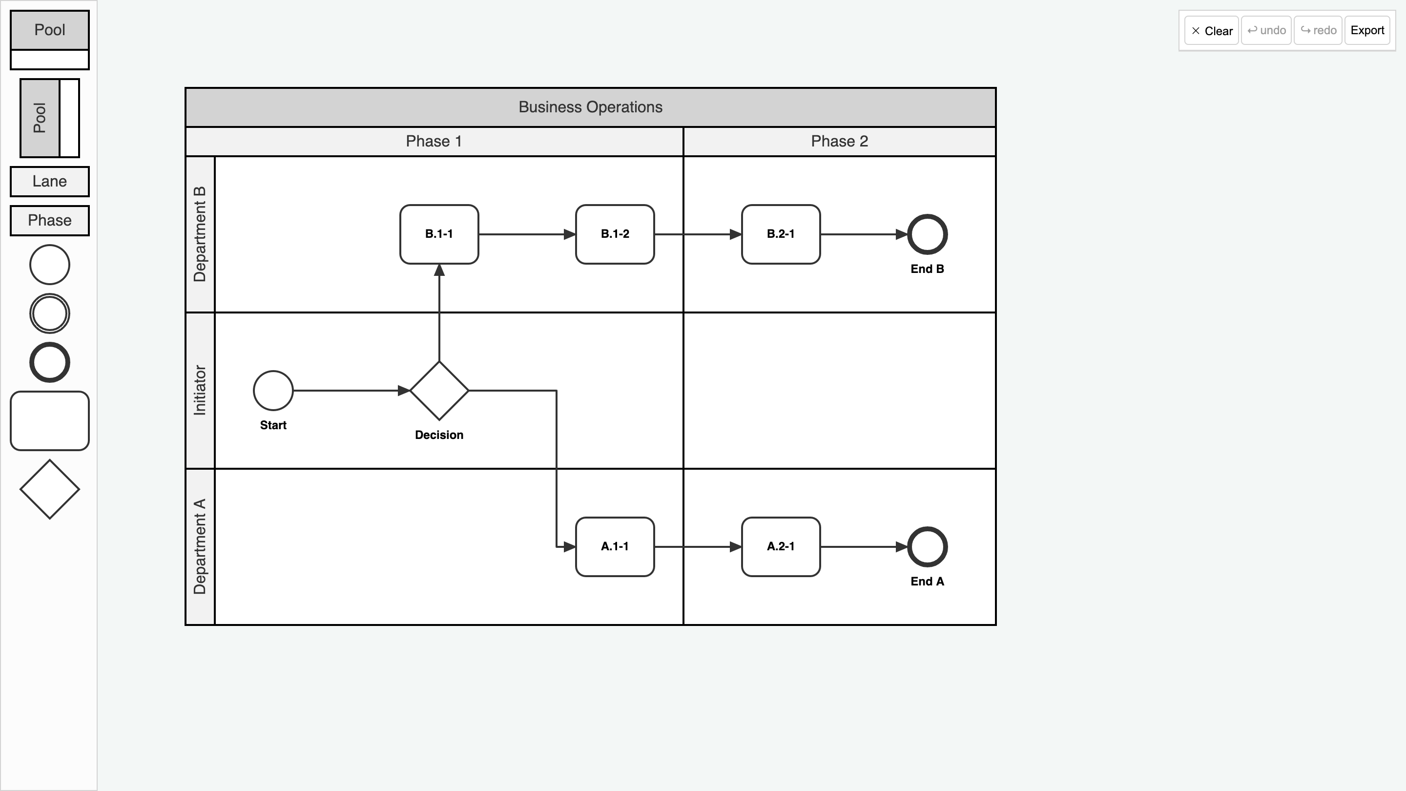
Discover an advanced implementation of BPMN Pools, Swimlanes, and Phases, enabling the creation of both vertical and horizontal swimlanes. The application supports exporting diagrams to the BPMN XML format and importing BPMN XML files by simply dragging and dropping them onto the paper.
Implementation details...
- This application demonstrates how to interact with swimlanes and phases, including how to insert new ones, reorder, and resize them, with automatic adjustments based on content.
- The swimlanes and phases are content-aware, preventing them from being resized beyond their content boundaries.
- The application includes previews and highlights to clarify the outcomes of your actions, such as highlighting target lanes and phases for dropping items.
- The new BPMN Pool shapes are designed as composable elements, enabling the creation of custom pools, swimlanes, and phases.
- Export to BPMN XML format is supported, including the new pool shapes (phases are excluded as they are not part of the BPMN2 specification).
apps.SheetCutting - add new app
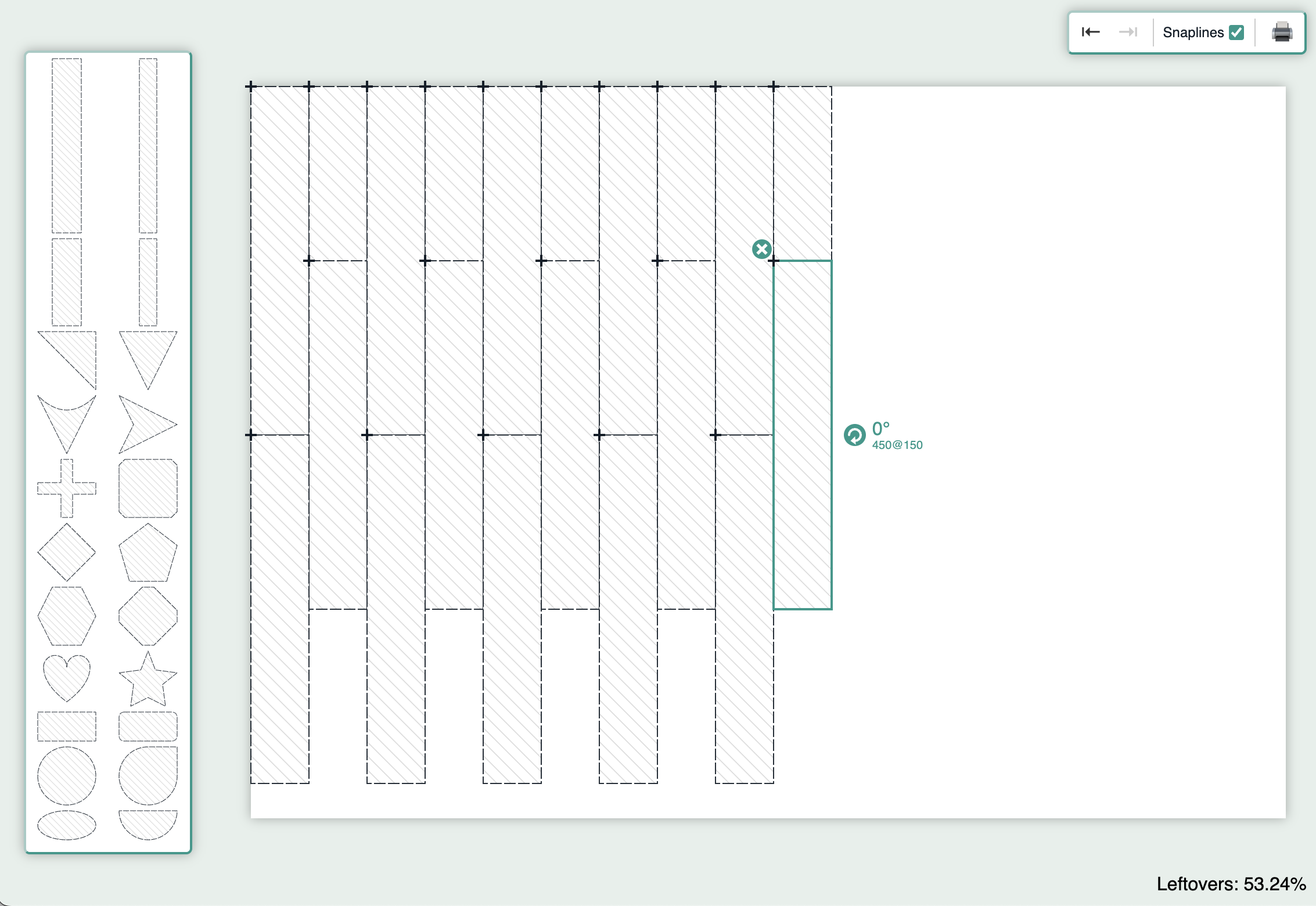
The new Sheet Cutting application is a powerful tool for creating and optimizing cutting plans for sheets of material. It effectively identifies overlapping elements that may cause issues during the cutting process and clearly communicates these to the user.
Implementation details...
- The SheetCutting application implements a custom rotation method for elements, bypassing the built-in
anglemechanism. Whenever an element is rotated, the application recalculates its shape morphology and dimensions to reflect the new orientation. This ensures precise alignment of snaplines and the grid with the rotated element. - Additionally, accurate representation of shape morphology is utilized to detect intersections between elements, identify overlaps, and calculate the area of the sheet occupied by the shapes.
apps.TheoryOfChange - add new app
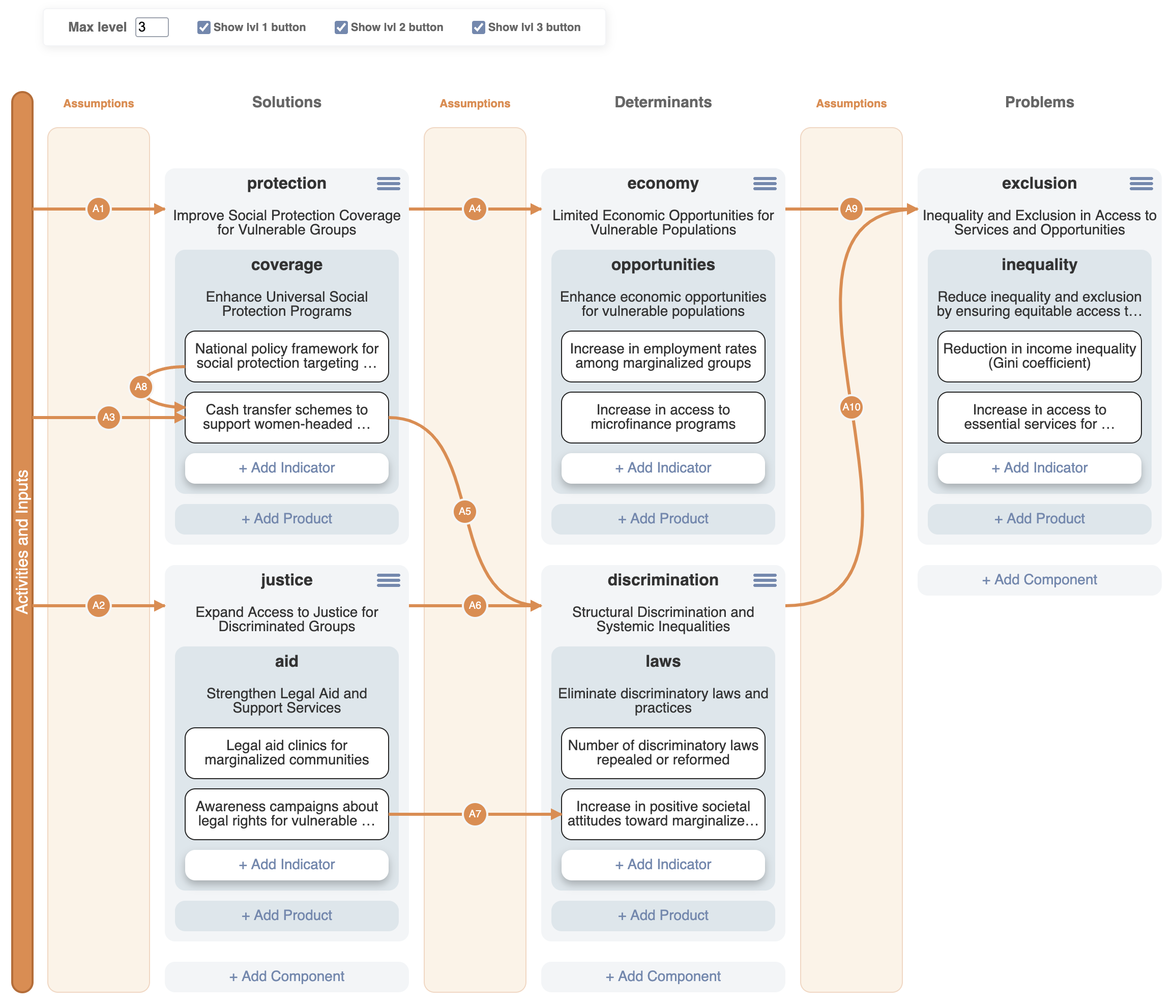
Does your upcoming project require an in-depth analysis of potential outcomes and impacts? The Theory of Change application is designed to help you visualize the goals, strategies, and challenges in your project.
Implementation details...
- The Theory of Change application utilizes a
StackLayoutcombined with nested elements. - During reconnection, the application hides all elements that cannot be connected, unlike the default
markAvailableoption, which only highlights valid targets. This approach helps users focus solely on connectable elements, reducing confusion. - Elements can be rearranged within columns by dragging their designated drag handles, rather than dragging the elements directly.
apps.TreeDesigner - add new app
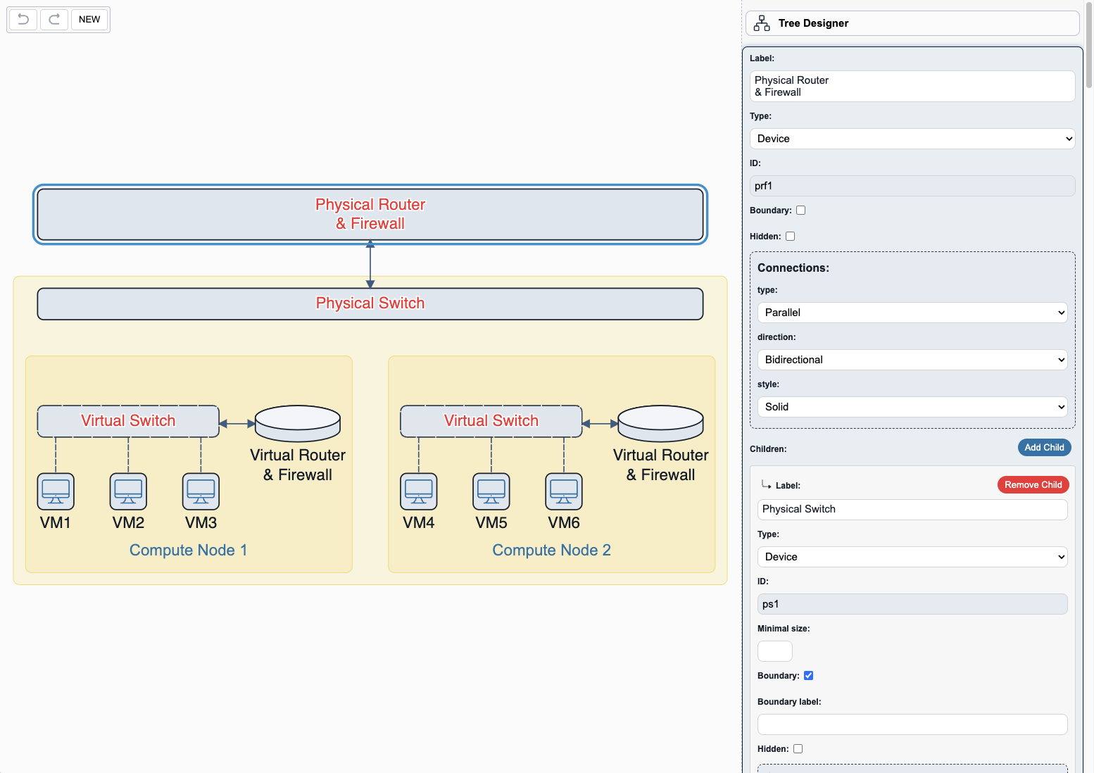
The Tree Designer application is a visual tool for building and editing tree structures. It allows the users to use a form-based interface to create and customize tree nodes and edges, as well as add or remove child nodes to adjust the hierarchy as needed.
Implementation details...
Inspectoris utilized to edit the application JSON, serving as the source of truth, which is subsequently used to generate the actual JointJS nodes and edges.CommandManagermonitors changes made to the application JSON rather than the graph directly.
apps.KitchenSink - redesign
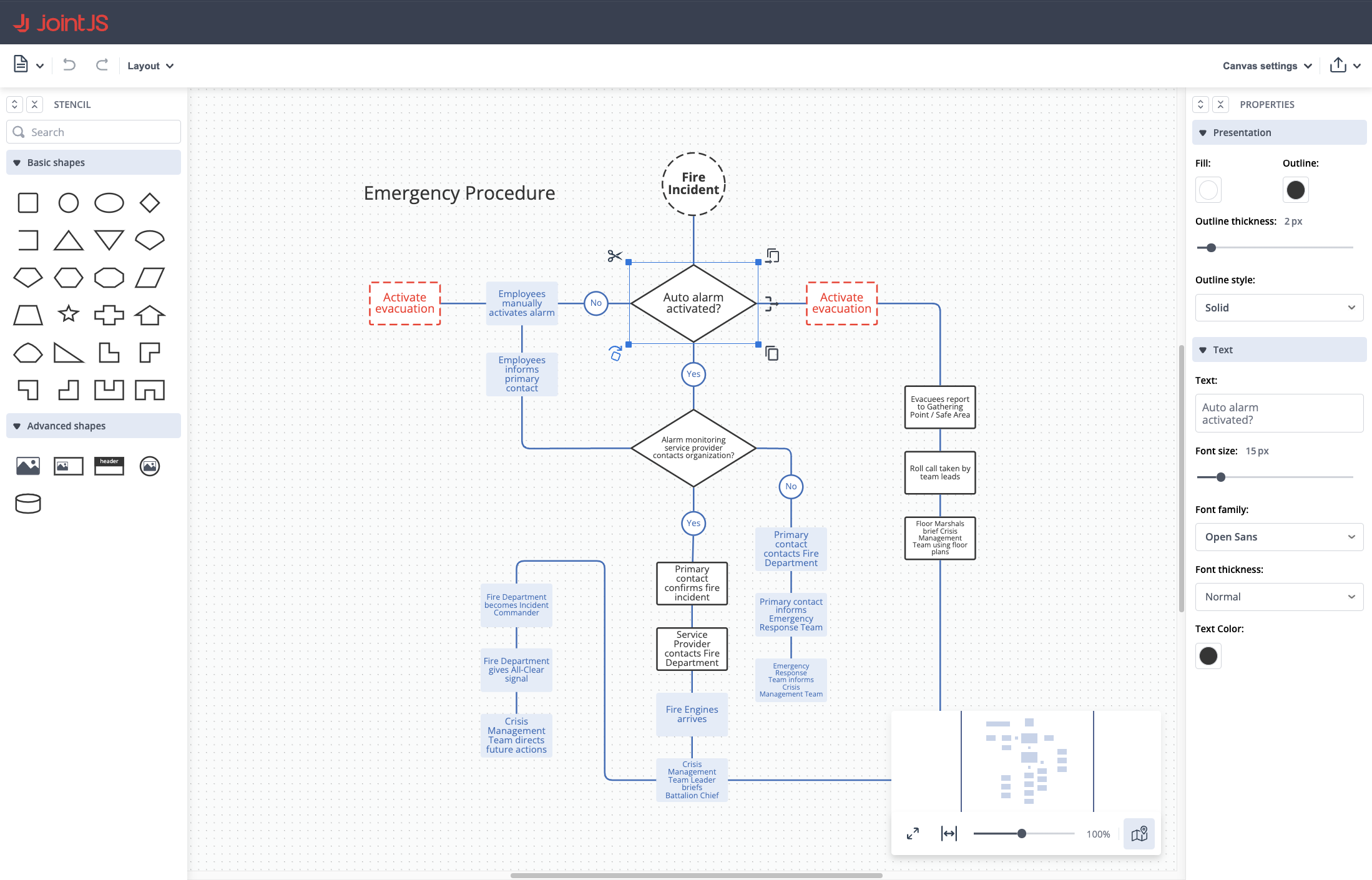
The Kitchen Sink application had long been due for a refresh, so we went all out to bring you a completely new, modern design. The updated look delivers a more intuitive and user-friendly experience, making it easier than ever to explore and interact with the extensive range of JointJS+ features.
format
BPMNExport
format.BPMNExport - better support for customization via class methods of exportable objects
In version 4.1, we improved the structure of exportable objects, improving capabilities of creating custom exportables using extension of ES6 classes via overriding parent class methods. Let's look at the basic example of a custom exportable:
Previously:
class CustomLabelEvent extends exportableObjects.Event {
}

const exportResult = toBPMN(paper, {
    exportableObjectFactories: {
        'bpmn2.Event': (cellView, defaultFactory) => {
            const exportableObject = defaultFactory();
            return new CustomLabelEvent(
                cellView,
                'Event: ' + exportableObject.type,
                exportableObject.markers,
                exportableObject.label
            );
        }
    }
});
In version 4.1, if you want to change the default properties of exportables you can override class methods instead of using constructor parameters:
class CustomLabelEvent extends exportableObjects.Event {
    override getLabelText() {
        return `Event: ${super.getLabelText()}`;
    }
}

const exportResult = toBPMN(paper, {
    exportableObjectFactories: {
        'bpmn2.Event': (cellView) => new CustomLabelEvent(cellView)
    }
});
Notice that it was previously mandatory to pass type, markers, and label constructor parameters to preserve default behavior. In version 4.1, we made these parameters optional and the default values are read using exportableObjects.Event class methods.
Here are the details about the new methods and exportable objects (the full list can be found in our API reference):
New exportable objects
We added exportable objects for newly introduced BPMN2 Pool shapes...
exportableObjects.CompositePoolexportableObjects.HorizontalPoolexportableObjects.VerticalPool
We added an exportable object for the bpmn2.DataStore shape:
exportableObjects.DataStore
class DataStore extends ExportableObject {
    constructor(cellView: dia.CellView, label?: string);
    label: string | null;
    toDataStoreXMLElement(): Element | null;
    toDataStoreReferenceXMLElement(): Element;
    toShapeXMLElement(): Element;
}
New methods in exportableObjects.ExportableObject
Add getLabelNode(), getLabelText(), getBounds(), and defineExtensionElements() to all exportable objects to help with customizing the export process.
Here is a small example of storing custom data in BPMN XML format:
import { toBPMN, exportableObjects, createExtensionElement } from '@joint/format-bpmn-export';

class CustomGateway extends exportableObjects.Gateway {

    override defineExtensionElements(): Element {
        const customDataElement = createExtensionElement('customData');
        customDataElement.textContent = this.cell.get('customData');
        return [customDataElement];
    }
}

const exportResult = toBPMN(paper, {
    exportableObjectFactories: {
        'bpmn2.Gateway': (cellView) => new CustomGateway(cellView)
    }
});
And here is an example of how to import this custom data back:
import { fromBPMN, findExtensionElements } from '@joint/format-bpmn-import';

const importResult = fromBPMN(xmlDoc, {
    /* ... */
    cellFactories: {
        'task': (xmlNode, xmlDoc, defaultFactory) => {
            const cell = defaultFactory();
            const extensionElements = findExtensionElements(xmlNode);
            const customData = extensionElements.find((element) => element.localName === 'customData');
            if (customData) {
                cell.set('customData', customData.textContent);
            }
            return cell;
        }
    }
});
The examples above utilize two utility functions, createExtensionElement(localName: string): Element and findExtensionElements(xmlNode: Element): Element[], which assist in creating and locating custom extension elements in BPMN XML.
New methods in exportableObjects.AbstractPool
Add getOrientation(), getHeader(), getLanes(), and getLaneIdByCell() methods to exportableObjects.AbstractPool class.
Previously, creating custom shapes that could be exported as BPMN pools (<participant/>) or subprocesses was limited. Now, it is possible to create custom Pools for export using the exportableObjects.AbstractPool class, which provides several methods that users can override.
class CustomPool extends exportableObjects.AbstractPool {
    override getOrientation() {
        // custom implementation
    }

    override getHeader() {
        // custom implementation
    }

    override getLanes() {
        // custom implementation
    }

    override getLaneIdByCell(cell: dia.Cell) {
        // custom implementation
    }
}

const exportResult = toBPMN(paper, {
    exportableObjectFactories: {
        'custom.Pool': (cellView) => new CustomPool(cellView)
    }
});
New methods in exportableObjects.Activity
Add isSubprocess() method to exportableObjects.Activity class:
class CustomSubprocess extends exportableObjects.Activity {
    override isSubprocess() {
        return true;
    }
}

const exportResult = toBPMN(paper, {
    exportableObjectFactories: {
        'custom.Subprocess': (cellView) => new CustomSubprocess(cellView)
    }
});
format.BPMNExport - other export improvements
- fix order of elements in XML according to BPMN2 schema
- fix missing
targetNamespaceattribute in BPMN XML (configurable viatargetNamespaceoption) - fix export of
bpmn2.Gatewayshape without a marker - fix link export so that it takes link view route into account
- enable exporting
isCollectionattribute ofbpmn2.DataObjectshape
BPMNImport
format.BPMNImport - support for importing new BPMN2 pools
You can now import the new BPMN2 Pool shapes into your application.
Note that if you want the BPMN XML to be parsed using the new pool shapes, you need to explicitly set the new useLegacyPool option to false in the fromBPMN() function.
format.BPMNImport - add embedCell callback option to fromBPMN() function
Added new embedCell: (parent: dia.Cell, child: dia.Cell) => void; callback option which can be used to control cell embedding during import. By default it embeds just calls parent.embed(child); for all cells except bpmn2.Swimlane which are added to bpmn2.CompositePool in a special way.
format.BPMNImport - other import improvements
- enable importing
isCollectionattribute ofDataObjectelement - allow annotations without
textattribute to be imported - add import of
dataStoreReferenceelement intobpmn2.DataStoreshape - add
linedecisiveElement to make custom line shapes
SVG
format.SVG - fix useComputedStyles feature when grid is not exported
Using grid: false combined with useComputedStyles: true previously did not set the computed styles to all exported SVG nodes. We resolved the issue for version 4.1.
format.toSVG(paper, callback, {
    useComputedStyles: true, // default
    grid: false, // default
});
Visio
format.Visio - update fromPaper() method of VisioPage
We added new options to fromPaper() method to enhance export capabilities.
beginArrow/endArrow- these options can be either strings or callbacks which determine how start/end markers should be exported into Visio file. Visio uses markers from a fixed list of available markers, so it is not possible to export SVG markers. The provided value should contain an index of an arrow type from the Visio file.useRecalcDocument- should the exported Visio file use theuseRecalcDocumentspecial property to recalculate functions on file opening? If you are using default export you should set this tofalse, because it interferes with exporting link styling. The default istrue.
Additionally, exportElement and exportLink options may now return JXON objects. If you want to utilize default export behavior and then change some things manually, you can use templates parameter to get default JXON and modify it.
exportElement: async(elementView, page, templates) => {
    // get default JXON for the elementView;
    const shapeJXON = templates.fromNodes(elementView);

    // update shapeJXON as you want

    return shapeJXON;
}
format.Visio - add scalable option to default toGraphCells() method of VisioPage
We added new scalable option (false by default) which imports Visio shapes as scalable shapes. You want to use this options if you want to be able to resize JointJS shapes after import. Note that the resulting shapes may behave differently than the original Visio shapes because the resize behavior in JointJS is different.
format.Visio - fixes in export behavior
- Fixed export when exporting shapes with
fill: 'transparent'. - Fixed export when using anchors in links. Now correctly translates it into Visio file.
- Fixed export when using different connectors. Now export respects original form of a link.
format.Visio - fixes in import behavior
- Fixed import when Visio shape has
HideTextcell. - Fixed import when Visio shape has
ForeignData(images etc.) in master shapes. - Fixed import when Visio shape has arrowheads defined in StyleSheet.
- Fixed import when Visio shape has several geometries which are behaving like
fill-rule="evenodd". - Fixed default import behavior regarding the element origin.
graphUtils
graphUtils - pass siblingIndex to makeElement callback
The siblingIndex is now passed as an extra parameter to the makeElement callback option of the graphUtils.constructTree function. You may use this in your logic whenever the features of a tree element depend on its index among its siblings (e.g. "Is this the second child of its parent?").
This is useful when you need to record the path of the element within the tree structure, as in the following example:
const cells = graphUtils.constructTree(data, {
    makeElement,
    makeLink,
    children: 'children'
});

function makeElement(node, parent, siblingIndex) {
    const { id } = node;
    const element = new shapes.standard.Rectangle({
        id,
        size: { width: 60, height: 30 }
    });
    const properties = {};
    // Set `path` property in the element.
    if (parent) {
        properties.path = parent.get('path') + '/children/' + siblingIndex;
    } else {
        properties.path = 'data';
    }
    element.prop(properties);
    return element;
}

function makeLink(parent, child) {
    return new shapes.standard.Link({
        id: `${parent.id}-${child.id}`,
        source: { id: parent.id },
        target: { id: child.id }
    });
}
How we used the siblingIndex parameter in action can be seen in the Tree Designer app.
ui
BPMNFreeTransform
ui.BPMNFreeTransform - add new component
We added a new component extending the FreeTransform UI component, which provides sensible defaults for use within BPMN2 applications (with any element shape), and additional default logic when used with the new composable BPMN2 pool shapes.
When resizing, the component automatically enforces minimal width and height restrictions on pools, swimlanes and phases (taking into account the padding model attribute of the pool and the headerSize model attribute of its contained swimlanes and phases). This logic ensures that a minimal amount of space is left around all embedded elements (based on contentMargin model attribute). If there are no embedded elements, it ensures a minimal amount of space according to minimumLaneSize and padding.
The component also automatically listens for resize events on the graph and intervenes whenever a pool, swimlane, phase or an embedded element are resized. This makes sure that whenever a component of a pool is resized, the sizes of all other components of that pool are resized and the pool stays in sync.
Clipboard
ui.Clipboard - add saveToLocalStorage() and fetchCellsFromLocalStorage() methods
Add methods to programmatically save and load cells to and from local storage:
// Tab 1
const { ui } from '@joint/plus';
const clipboard = new ui.Clipboard();

clipboard.reset(getSomeCells());
clipboard.saveToLocalStorage();
// Tab 2
const { shapes, ui } from '@joint/plus';
const clipboard = new ui.Clipboard();

const cells = clipboard.fetchCellsFromLocalStorage(shapes);
doSomethingWithCells(cells);
Previously, accessing the clipboard content stored in local storage required a workaround of calling pasteCells() into any graph first to make the clipboard fetch it. This is no longer necessary
ui.Clipboard - add cloneCells() callback option
We added a new cloneCells() callback option to allow you to control how cells are cloned. In the following example, the callback is used to save a reference to original cell on the cloned cells:
const clipboard = new ui.Clipboard({
    cloneCells: (cells) => {
        const clonesMap = util.cloneSubgraph(cells);
        const clones = Object.values(clonesMap);
        // Update the clones using the references to the original cell:
        cells.forEach(cell => {
            clonesMap[cell.id].set('originalId', cell.get('originalId') || cell.id);
        });
        return clones;
    }
});
FreeTransform
ui.FreeTransform - add useBordersToResize option
Introduces a new useBordersToResize option, providing a more intuitive resizing experience by enabling users to resize elements by dragging their borders, rather than the default behavior of resizing via handles.
The following example showcases the new option in action and provides a comparison with the default behavior:
The "Visible useBordersToResize" button lets you see the actual capture area of the invisible resize handles.
Additionally, we now expose variables in the FreeTransform CSS which allow you to change the size and offset of the resize handles (--jj-free-transform-handle-size, --jj-free-transform-handle-offset).
ui.FreeTransform - add direction argument to minSize callback options
This change adds a direction parameter to minWidth, minHeight, maxWidth, maxHeight options of ui.FreeTransform, when those are defined as callback functions.
You can use this parameter inside your logic, if you have an advanced use case where the minimum/maximum dimension depends on the direction from which the FreeTransform is being resized (for example, to take embedded elements into account). This functionality is used by the new BPMNFreeTransform component.
Halo
ui.Halo - add overlay type
The new overlay type along with the groups option lets you define handle positions and automatically organizes handles with the same position into a grid.
The surrounding and toolbar types are now deprecated (even though the surrounding is still the default type - backwards compatibility). The overlay type is now the recommended way to organize handles in a Halo.
The following example demonstrates how to use the new overlay type to create a set of fork handles next to the element:
ui.Halo - add className, hideOnDrag and data options to handles
We added new options to the handles to allow you to customize the appearance and behavior of each handle:
className- a string that specifies a CSS class to be addedhideOnDrag- a boolean that specifies whether the halo should be hidden when draggingdata- an object that can be used to store additional data that can be accessed in the handle's event callbacks andmakeElement/makeLinkcallbacks
ui.Halo - add CSS variables
New CSS variables have been added to the Halo component to allow you to customize the appearance of the handles and the info box:
/* size of the handles */
--jj-halo-handle-width: 20px;
--jj-halo-handle-height: 20px;
/* size of the icons / or text if provided  */
--jj-halo-handle-font-size: 18px;
/* number of pixels the info box overlaps the element */
--jj-halo-box-horizontal-overlap: 20px;
/* offset of the info box from the element */
--jj-halo-box-offset: 30px;
ui.Halo - add static getDefaultHandle() method
This new method allows you to revert the removal/change of any Halo handle. It returns the default Halo handle configuration with the given name (remove, resize, rotate, fork, clone, link, unlink, rotate, direction).
// remove default rotate handle
halo.removeHandle('rotate');
// add default rotate handle
halo.addHandle(Halo.getDefaultHandle('rotate'));
ui.Halo - add makeElement() and makeLink() callback options
We added two new callback options to Halo options:
- The
makeElement()callback allows you to customize the element that is created when the user forks or clones an element with the Halo. It's a replacement for thecloneoption (making it deprecated). - The
makeLink()callback allows you to customize the link that is created when the user links two elements with the Halo or forks the element with the Halo.
Here's an example of how to use makeElement() and makeLink() callbacks to add 2 new handles to the Halo
to fork an element into a new element with 2 different colors:
const halo = new Halo({
    cellView,
    handles: [],
    boxContent: null,
    makeLink: function({ action }) {
        const link = new shapes.standard.Link();
        switch (action) {
            case 'fork-blue':
                link.attr('line/stroke', 'blue');
                break;
            case 'fork-red':
                link.attr('line/stroke', 'red');
                break;
        }
        return link;
    },
    makeElement: function({ action }) {
        const element = new shapes.standard.Rectangle({ size: { width: 100, height: 60 }});
        switch (action) {
            case 'fork-blue':
                element.attr('body/stroke', 'blue');
                break;
            case 'fork-red':
                element.attr('body/stroke', 'red');
                break;
        }
        return element;
    }
});

halo.addHandle({
    ...Halo.getDefaultHandle('fork'),
    name: 'fork-blue',
    position: Halo.HandlePosition.SE,
    icon: './assets/link-blue.svg',
});

halo.addHandle({
    ...Halo.getDefaultHandle('fork'),
    name: 'fork-red',
    position: Halo.HandlePosition.NE,
    icon: './assets/link-red.svg',
});
ui.Halo - reusable default handles
Defining multiple handles with the same action (e.g. forking) now triggers the correct events, and also validates and toggles the visibility of each button separately.
Dragging the handle will create a link and trigger action:[name]:add:
halo.addHandle({
    ...Halo.getDefaultHandle('link'),
    name: 'link1'
});
// triggers `action:link1:add`

halo.addHandle({
    ...Halo.getDefaultHandle('link'),
    name: 'link2'
});
// triggers `action:link2:add`
The visibility of handles is correctly set for both fork1 and fork2:
halo.addHandle({
    ...Halo.getDefaultHandle('fork'),
    name: 'fork1'
});

halo.addHandle({
    ...Halo.getDefaultHandle('fork'),
    name: 'fork2'
});
ui.Halo - fix to make sure handle attrs property does not override icon
Previously, setting the style property inside the attrs could accidentally remove the icon:
halo.addHandle({
    /* ... */
    icon: './icon1.png',
    attrs: {
        '.handle': { style: 'opacity: 0.8' }
    }
});
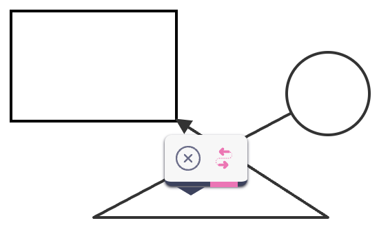
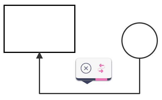
ui.Halo - fix to reverse vertices when direction handle is used
When changing the direction of a link via the direction handle, it is necessary to swap not only the source and target - the order of the vertices must also be reversed. We fixed this in version 4.1:
| Before fix | After fix |
|---|---|
 |  |
Inspector
ui.Inspector - allow defaultValue to be a function
The inputConfig.defaultValue of an input field definition can now be defined as a callback function with the signature (cell, path) => any. This is useful whenever the default value of an input field (the value shown by the input field in case the corresponding Cell property is undefined) is dynamic.
In the following example, the Inspector automatically assigns a new GUID to the data/id property upon being opened for the first time on any cell where data/id is undefined:
const inspector = new ui.Inspector({
    cell,
    inputs : {
        data: {
            id: {
                type: 'text',
                label: 'ID',
                attrs: {
                    input: {
                        readonly: true
                    }
                },
                index: 1,
                defaultValue: () => util.guid()
            },
            /* ... */
        }
    },
    /* ... */
});
PaperScroller
ui.PaperScroller - fix animation not working when browser is using scaling
We fixed an issue where the scrolling animation wouldn't be completed when in-browser scaling was set to any other value but 100%.
ui.PaperScroller - fix to keep the focus point on paper translate event with autoResizePaper
When using the autoResizePaper option, it was previously the case that when a cell was moved on the paper in a way that increased the paper size on one side while decreasing it on the opposite side, only a translate event was triggered (and no resize event). This prevented the PaperScroller from retaining its original focus point. We resolved the issue in version 4.1.
Selection
ui.Selection - add frames option
Version 4.1 adds the frames option to ui.Selection in order to select the appearance and behavior of selection frames.
We now provide several additional selection frame types that can be used to change the way the selection items are rendered, and may be more appropriate for your use case:
-
HTMLSelectionFrameListis a simple HTML rectangle that is a frame around the selected elements. It can be styled using CSS (including pseudo-elements), and it can stay at the same width regardless of the paper zoom level.const selection = new ui.Selection({
paper: paper,
frames: new ui.HTMLSelectionFrameList({
margin: 5,
rotate: true,
/* ... */
})
}); -
SVGSelectionFrameListis a simple SVG rectangle that is a frame around the selected elements. It can be present in SVG/PNG exports, and it can be configured to render under the elements and use non-uniform margin.const selection = new ui.Selection({
paper: paper,
frames: new ui.SVGSelectionFrameList({
margin: { horizontal: 5, top: 5, bottom: 25 },
layer: dia.Paper.Layers.BACK,
rotate: true,
/* ... */
})
}); -
HighlighterSelectionFrameListis a selection frame that uses the dia.HighlighterView to highlight the selected cells. You can use any of the built-in highlighters or create your own. For example, using themaskhighlighter allows you to show tight selection frames around the selected elements:const selection = new ui.Selection({
paper: paper,
frames: new ui.HighlighterSelectionFrameList({
highlighter: highlighters.mask,
options: { padding: 1 }
})
});Meanwhile, using the
addClasshighlighter allows you to add a class to the selected elements and style them using CSS that is different from their default style:const selection = new ui.Selection({
paper: paper,
frames: new ui.HighlighterSelectionFrameList({
highlighter: highlighters.addClass,
selector: 'body',
options: { className: 'highlighted' }
})
});
You can find more information about selection frames in our documentation.
This change is backwards compatible because LegacySelectionFrameList (which matches the previous appearance and behavior of the selection frame) is used as the default.
ui.Selection - add wrapper option
Adds wrapper option to Selection constructor, which specifies whether all selection frames should be wrapped in a rectangular HTML element. This option is true by default - this applies a legacy wrapper that matches the behavior of the Selection component prior to version 4.1.
You can hide the selection wrapper by setting this option to false. Alternatively, you can customize the look of the selection wrapper by providing an object with several properties (className, style, margin, usePaperScale, visibility), as detailed in our documentation. For example:
const selection = new ui.Selection({
    /* ... */
    wrapper: {
        style: {
            border: '2px dashed red',
        },
        margin: 10,
        visibility: (selection) => {
            // Do not show the wrapper if only 1 element is selected.
            return (selection.collection.length > 1);
        }
    }
})
You can use the setWrapperVisibility() method to set the visibility of a wrapper programmatically.
ui.Selection - optimize selection frame rendering
Previously, all changes in the diagram would trigger a selection update. We introduced two modifications in order to improve performance:
- Only update selection frames when a change is relevant to the selection (when one of the selected elements is updated).
- Reuse selection frames on collection reset (keep selection frames for elements which stayed in the collection).
ui.Selection - add selectLinks option
Previously, Selection was only able to select elements. By providing selectLinks: true, you can now select links as well.
const selection = new ui.Selection({
    /* ... */
    selectLinks: true
});
ui.Selection - add clone handle
We defined a new clone built-in tool for the Selection component. The tool is not enabled by default, but you can easily add it with the static getDefaultHandle() method:
selection.addHandle(Selection.getDefaultHandle('clone'));
When enabled, the clone tool is placed in the north-east corner of the Selection by default:
ui.Selection - add static getDefaultHandle() method
This new method allows you to revert the removal/change of any Selection handle. It returns the default Selection handle configuration with the given name (remove, rotate, resize, clone).
// remove default rotate handle
selection.removeHandle('rotate');
// add default rotate handle
selection.addHandle(Selection.getDefaultHandle('rotate'));
The method throws an exception if a handle with the given name does not exist - ui.Selection: default handle not found: ${name}.
ui.Selection - fix dragging for selected links
Version 4.1 fixes two issues with selected links:
- It now updates link selection frames whenever the links' connected elements are moved.
- When the user is trying to drag a link selection frame, the frame is now only changed when the links actually changes by the interaction (because dragging a link without also dragging its endpoints does not actually do anything).
ui.Selection - fix dragging for selections with a single cell
Version 4.1 fixes an issue where dragging a selection with a single cell would cause translation to be applied twice (by Selection and by the CellView as well). We now let the CellView do the interaction.
ui.Selection - fix to make sure handle attrs property does not override icon
Previously, setting the style property inside the attrs could accidentally remove the icon:
selection.addHandle({
    /* ... */
    icon: './icon1.png',
    attrs: {
        '.handle': { style: 'opacity: 0.8' }
    }
});
SelectionRegion
ui.SelectionRegion - add new component for selecting regions of various shapes
Sometimes it's useful to give users the option to select areas of different shapes and sizes. For example, you might want users to find all the elements that lie within a certain area on the paper. This area can simply be a rectangle, but it can also be an irregular shape drawn by the user, like the lasso tool.
The new SelectionRegion component of JointJS provides built-in implementations for rectangular, polygonal and range selection regions, which may be drawn by your users using the pointer device:
RectangularSelectionRegionclass.PolygonalSelectionRegionclass.RangeSelectionRegionclass.
Some common use cases for selection regions involve:
- Drawing a region and selecting all contained elements.
- Selecting an area to zoom in.
- Drilling down through data.
- Shifting all elements in a region
JointJS also makes it possible to define your own custom SelectionRegion implementation to match your specific use case. You can learn more in our documentation.
Here are some examples of how to use the selection regions to select elements and add them to a selection collection:
- Rectangle
- Polygon
- Range
Snaplines
ui.Snaplines - fix to prevent an exception when disabling/enabling snaplines during dragging
We resolved an issue which caused an exception to be thrown when the user enabled snaplines while dragging an element from the stencil. This allows the user to disable/enable snaplines at will while dragging the element.
StackLayoutView
ui.StackLayoutView - add insertElement() callback option
This new option callback allows you to override how an element is inserted into a stack on dragend. The callback is provided with two parameters which you can use in your logic - an options object, which specifies the sourceStack, sourceElement, targetStack and insertElementIndex (as detailed in our documentation), and the target StackLayoutView.
ui.StackLayoutView - pass event to canInteract() callback option
We now pass the current event as the last parameter of the canInteract() callback, which you refer to in your logic.
Stencil
ui.Stencil - add dragThreshold option
Adds the dragThreshold option to delay the drag start.
- A number denotes the number of
pointermoveevents before the drag starts. - If the value is
"onpointerdown"the dragging starts immediately onpointerdownevent.
This change allows you to bind custom actions on pointerdown events. For instance, a click on a stencil element to select it.
ui.Stencil - forward events from stencil groups to stencil
Events from stencil groups (each group is a JointJS Paper) are forwarded to the stencil with "group:" prefix and the group's paper as its first parameter.
stencil.on('group:my-event', (groupPaper, myId) => {
    console.log(groupPaper.model.get('group'), myId);
});
stencil.getPaper('group1').trigger('my-event', 1);
stencil.getPaper('group2').trigger('my-event', 2);
This is especially useful when you want to listen to the same UI event on each group, for example:
stencil.on('group:element:pointerclick', (groupPaper, elementView, evt, x, y) => {
    // e.g. select the element view
});
ui.Stencil - add cellCursor option
This option allows you to set the cell cursor to one specific cursor, overriding the default shape settings. When this option is in use, the draggable area of the shape is expanded to match its bounding box rectangle.
const stencil = new ui.Stencil({
    /* .. */
    cellCursor: 'grab'
});
We also added a new setCellCursor() method to allow you to change the cellCursor option programmatically:
// set cursor to `grab`
stencil.setCellCursor('grab');
// use the default cursor
stencil.setCellCursor('');
ui.Stencil - add autoZIndex option
When dragging cells from the stencil into your diagram, you usually want the dropped cells to be placed on top of any other cells.
However, it is now possible to override this automatic behavior by setting autoZIndex: false. This preserves the last z level of the dropped cell before it was dropped into the diagram (i.e. either while it was inside the stencil or when it was a drag clone). This allows you to set a custom z index on your cell before it is dropped into the diagram.
const stencil = new ui.Stencil({
    /* ... */
    autoZIndex: false
});
ui.Stencil - fix to remove invalid CSS
We removed several invalid CSS statements from the base Stencil CSS as well as from its dark and modern theme CSS.
ui.Stencil - fix the clone drop area parameter to always reflect final position
When the user drags an element from the stencil, and the element is snapped, the dropArea parameter in element:dragstart, element:drag, element:dragend and element:drop events now automatically reflects the snapped position.
ui.Stencil - fix to prevent dragged shape from being cut off when snapping
The stencil paper for dragging now has overflow: true by default.
Tooltip
ui.Tooltip - add enable/disable API
Added three new methods to the ui.Tooltip API:
disable()to prevent showing the tooltip on user interaction.enable()to start showing the tooltip on user interaction (after it was disabled).isDisabled()to determine if the tooltip is currently disabled.
This is useful when you want to prevent the tooltip from showing when the user interacts with an element, for example, when the user drags an element from the stencil.
ui.Tooltip - throw exception on invalid container
We now throw an exception when trying to initialize a Tooltip with an invalid selector provided as the value of the container option - ui.Tooltip: invalid container selector: ${container}.
Previously, an exception was shown on Tooltip display, which was confusing.
ui.Tooltip - fix to unbind hide action listeners on remove()
We resolved a memory leak caused by bound hide action listeners left over on Tooltip target elements whenever the listening Tooltip was removed.
shapes
shapes.bpmn2 - add shapes for BPMN2 pools, swimlanes and phases composable via drag-and-drop
Adds several new shapes for composable BPMN2 pools:
- Pools:
HeaderedHorizontalPoolandHeaderedVerticalPool - Pools without header:
HorizontalPoolandVerticalPool - Swimlanes:
HorizontalSwimlaneandVerticalSwimlane - Phases:
VerticalPhaseandHorizontalPhase
These shapes are independent of the older shapes.bpmn2.Pool shape, which works differently. The old bpmn2.Pool shape is deprecated now and will not be supported in future versions.
Horizontal pool types may contain horizontal swimlanes (header on the left) - which may contain embedded elements - and vertical phases (header on the top). Headered horizontal pools differ by having their own header (on the left by default, but this can be changed in custom shapes).
Conversely, vertical pool types may contain vertical swimlanes (header on the top) - which may contain embedded elements - and horizontal phases (header on the left). Headered vertical pools differ by having their own header (on the top by default, but this can be changed in custom shapes).
An API is provided for adding and removing swimlanes and phases to pools, and for keeping the pool's dimensions in sync with the dimensions of its contents. The new BPMNFreeTransform component uses this functionality for content-aware resizing.
These new types make it possible to build pools up from swimlanes and phases interactively via drag-and-drop, as illustrated in our BPMNPools application.
shapes.bpmn2 - we now generate valid IDs for all shapes according to the BPMN2 specification.
The new ID format begins with an underscore followed by a UUID, making it compliant with BPMN2 XML requirements. For example:
'_abd515fa-36f1-4700-b268-3b3ba09c40c3'
Previously, IDs could start with a numeric character, which is not permitted in BPMN2.
When exporting a diagram to BPMN2 XML, we prefix the IDs with id_ to ensure they are valid. This ensures compatibility with diagrams created in earlier versions of JointJS.
If you prefer to use the same IDs in the BPMN2 XML as in the diagram, you can configure this through the IdentifierFactory option.
import { toBPMN, IdentifierFactory } from  '@joint/format-bpmn-export';

class CustomIDFactory extends IdentifierFactory {

    getCellXMLId(cell: dia.Cell) {
        return cell.id;
    }
}

toBPMN(paper, {
    identifierFactory: new CustomIDFactory()
});
layout
ForceDirected
layout.ForceDirected - improve algorithm for force directed layout
We improved the algorithm behind force directed layout to allow more customization and interactivity. We added multiple new options which change behavior of the algorithm in different ways alongside new methods to control the layout. This change is not breaking as all options are still preserved, but the behavior and layout process is changed.
The algorithm now uses the Barnes-Hut approximation under the hood for repulsive force simulation which will improve performance for large amount of cells.
An important feature of this update is that it makes it possible to interact with cells during the simulation. When the user interacts with cells, you can change the properties of the layout in order to notify the layout algorithm about the new changes. For example, you can add new elements to the layout:
paper.on('element:pointerclick', () => {
    /* ... */
    const newElement = new shapes.standard.Rectangle(/* ... */);
    const newLink = new shapes.standard.Link(/* .., */);
    graph.addCells([newElement, newLink]);
    // add new cells to the layout
    forceLayout.addElement(newElement);
    forceLayout.addLink(newLink);
    // restarts the algorithm with given temperature
    forceLayout.restart(0.5);
});
You can explore these interactions in the following demo - you can create duplicate elements by clicking existing elements, and you can drag all elements to new positions .
layout.ForceDirected - add new radial force
We added new radial force to the layout algorithm. The radial force is a special force that can be used to keep elements away from each other. It is useful when you want to create a diagram where elements are placed around a specific point.
You can enable radial force by setting the radialForceStrength option in the constructor. The radial force is applied to all elements in the graph.
Here is the example of radial force used to prevent elements from overlapping. Try to drag the elements around:
layout.ForceDirected - add new methods for adjusting the simulation
We added multiple new methods to adjust the layout.
Add/remove cells to/from the layout:
addElement()addLink()removeElement()removeLink()
Modify cell's position, velocity, weight and many more:
getElementData()getLinkData()changeElementData()changeLinkData()
Change/check the simulation state:
restart()finalize()hasConverged()canIterate()
The full list of new methods for force directed layout can be found in our API reference.
layout.ForceDirected - add new options to define the layout behavior
We added multiple new options which change behavior of the algorithm in different ways.
layoutAreaweightDistributionrandomizerandomizeAreagravitygravityTypelinkBiasthetadeltaTvelocityDecaytMintTargettimeQuantumelementPointradialForceStrength
The following options have been deprecated:
heightwidthxy
The full list of new options for force directed layout can be found in our API reference.
layout.ForceDirected - update cell attributes for fine-tuning the layout algorithm.
We added a new workflow for controlling behavior using cell attributes. Now all attributes are contained in the forceDirectedAttributes object in model attributes:
| Attribute | Description |
|---|---|
weight | Sets the weight of the element |
fixed | Makes the position of the element fixed in place |
radius | Sets the radius for the element |
strength | Sets the strength of the link |
distance | Sets the target distance of the link |
el.prop(['forceDirectedAttributes', 'weight'], 2);
You can change the name of the attribute object using attributesName static property.
The old way of setting attributes is preserved for backward compatibility.
TreeLayout
layout.TreeLayout - add updateSiblingRank() callback option
You can now override the default way the TreeLayout sets the siblingRank attribute on elements by providing your own updateSiblingRank() callback option to the constructor. For example:
const tree = new layout.TreeLayout({
    graph,
    parentGap: 50,
    siblingGap: 10,
    updateSiblingRank: (element, siblingRank) => {
        element.set({ siblingRank }, { addToHistory: true });
    }
});
layout.TreeLayout - pass an instance of current model to all update and filter callback options
The updatePosition(), updateVertices(), updateSiblingRank() and filter() callback options are now passing an instance of the current TreeLayout model as the last parameter. You can use this in your callback logic.
DirectedGraph
layout.DirectedGraph - add graph option to fromGraphLib()
The fromGraphLib() utility can now be used without providing the graph reference through context (this was an oversight during the conversion of DirectedGraph into a standalone package).
For backward compatibility, passing graph through context is still supported but is now deprecated. Instead, the graph should be provided via the graph option:
import { dia, shapes } from '@joint/core';
import { DirectedGraph } from '@joint/layout-directed-graph';
import * as graphlib from 'graphlib';

// Create a graph in Graphlib:
const glGraph = new graphlib.Graph();
glGraph.setNode(1, { x: 50, y: 50, width: 100, height: 50, label: 'A' });
glGraph.setNode(2, { x: 50, y: 150, width: 100, height: 50, label: 'B' });
glGraph.setNode(3, { x: 50, y: 250, width: 100, height: 50, label: 'C' });
glGraph.setEdge(1, 2, { label: 'Hello' });
glGraph.setEdge(2, 3, { label: 'World!' });

// Get a JointJS representation of the Graphlib graph:
const targetGraph = new dia.Graph({}, { cellNamespace: shapes });
const graph = DirectedGraph.fromGraphLib(glGraph, {
    graph: targetGraph,
    importNode: (nodeId, glGraph, graph, opt) => {
        const nodeData = glGraph.node(nodeId);
        const element = new shapes.standard.Rectangle({
            id: nodeId,
            position: { x: nodeData.x, y: nodeData.y },
            size: { width: nodeData.width, height: nodeData.height },
            attrs: { label: { text: nodeData.label }}
        });
        graph.addCell(element);
    },
    importEdge: (edgeObj, glGraph, graph, opt) => {
        const edgeData = glGraph.edge(edgeObj);
        const link =  new shapes.standard.Link({
            source: { id: edgeObj.v },
            target: { id: edgeObj.w },
            labels: [{ attrs: { text: { text: edgeData.label }}}]
        });
        graph.addCell(link);
    }
});
dia
SearchGraph
dia.SearchGraph - add new graph component optimized on spatial queries
In many applications, it is essential to search for cells based on their spatial properties. For example, you might want to find all cells within a given rectangle. The naive approach is to iterate over all cells and check if they intersect with the rectangle.
JointJS+ improves upon that approach with the SearchGraph class that is optimized for spatial queries by using a quadtree to index cells according to their bounding boxes. Since the search API is widely used internally, this swap can boost your application's performance without requiring changes to your existing code - SearchGraph is a drop-in replacement for JointJS Graph:
import { dia, shapes } from '@joint/plus';

const graph = new dia.SearchGraph({}, { cellNamespace: shapes });
Here's a list of features that can benefit from using the SearchGraph:
- Finding elements under the element being dragged (e.g. for
embedding). - Finding elements under the link being dragged (e.g. for
snapLinks). - Finding elements and links under the selection region (e.g. in
ui.Selection). - The
findCellViewsAtPoint()andfindCellViewsInArea()Paper methods (and their Element and Link counterparts).
In the following example diagram editor, SearchGraph is used to continuously find all elements within the selection region as the user drags the mouse:
Meanwhile, the following demo shows how SearchGraph can be useful in applications that require collision detection or snapping elements to a grid.
You can switch SearchGraph's mode of operation to further optimize the performance of your application:
- Use eager mode when queries are frequent and data needs to be constantly up-to-date.
- Use lazy mode when changes are frequent, but queries are less common, or when you want to delay the cost of updating until necessary.
// enter `lazy` mode
searchGraph.setQuadTreeLazyMode(true);

// enter `eager` mode
searchGraph.setQuadTreeLazyMode(false);
You can learn more in our documentation, including a detailed discussion on the time and space complexity of SearchGraph.
Paper
dia.Paper - add methods to find cell/element/link views in paper
We added methods to find Cell/Element/Link views in paper based on their geometry.
If you need to find a view that contains a given point (an object with x and y properties), use one of the following:
If you need to find a view that contains a given rectangle (an object with x, y, width and height properties), use one of the following:
We deprecated the following two methods, which worked only for ElementViews:
findViewsFromPoint()findViewsInArea()
ElementView
dia.ElementView - add getTargetParentView() method
This new method returns the CellView (if any) that would become the parent of the currently dragged element if the dragging were to finish immediately:
paper.on('element:pointermove', (elementView, evt) => {
    console.log(elementView.getTargetParentView(evt));
});
It can also be used while the user is dragging an element from the Stencil:
stencil.on('element:drag', (cloneView, evt) => {
    console.log(cloneView.getTargetParentView(evt));
});
dia.ElementView - fix to prevent exception when position or size is not defined
We fixed an issue where an exception was thrown when the position or size of an element was not defined on the model.
This could have been happening if you defined a class and overrode the defaults() method without extending them.
LinkView
dia.LinkView - update tools when labels change
The dia.LinkView now updates its tools when the labels of the link change. This means that if you change the labels of a link, the tools will be updated to reflect the new state.
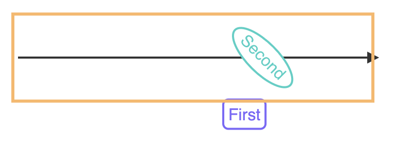
dia.LinkView - fix to invalidate the root node cache when labels change
After moving or changing labels, we now invalidate the root node's cache (which keeps track of the node's bounding box).
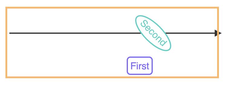
This fix was necessary because changing the label position could affect the overall link bounding box:
| Before fix | After fix |
|---|---|
 |  |
CellView
dia.CellView - expose special presentation attributes API
JointJS implements numerous special presentation attributes that offer advanced functionality beyond that of native SVG attributes. In version 4.1, we are exposing the API behind special presentation attributes functionality in order to let you define your own presentation attributes.
If you want to learn more about these attributes, you can read our dedicated guide.
The following example shows how to re-define the stroke-dasharray attribute to support calc() expressions, enabling you to draw a rectangle with a stroke applied only to the top edge:
class OverlineRect extends shapes.standard.Rectangle {

    defaults() {
        return util.defaultsDeep({
            type: 'OverlineRect',
            attrs: {
                body: {
                    strokeDasharray: 'calc(w) calc(2 * h + calc(w))',
                    strokeWidth: 5,
                    stroke: 'red',
                    fill: '#f5f5f5'
                }
            }
        }, super.defaults);
    }

    static attributes = {
        'stroke-dasharray': {
            set: function(value, refBBox) {
                if (!util.isCalcExpression(value)) return value;
                return util.evalCalcExpression(value, refBBox);
            }
        }
    };
}
dia.CellView - add isIntersecting() method
We added a new cellView.isIntersecting() method to check whether the CellView is intersecting with given geometry shape:
- For elements, the
shapewe run the intersection test against is the view bounding box of the element. - For links, it is the connection path of the link.
Graph
dia.Graph - accept toJSON() options
The graph.toJSON() method now accepts opt.cellAttributes options to modify its result. These options will be used for all exported cells in the same manner that cell.toJSON() method describes.
const graph = new dia.Graph({}, { cellNamespace: shapes });

graph.toJSON({
    cellAttributes: {
        ignoreDefaults: ['attrs', 'size'],
        ignoreEmptyAttributes: true
    }
});
dia.Graph - add transferCellEmbeds() and transferCellConnectedLinks() methods
Added two new methods to the Graph API:
-
graph.transferCellEmbeds(): This method transfers all embeds from thesourceCellto thetargetCell.const graph = new dia.Graph({}, { cellNamespace: shapes });
const parent = new shapes.standard.Rectangle({ id: 'originalParent' });
const child = new shapes.standard.Rectangle();
parent.embed(child);
const newParent = new shapes.standard.Rectangle({ id: 'newParent' });
graph.addCells(parent, child, newParent);
console.log(child.parent()); // 'originalParent'
graph.transferCellEmbeds(parent, newParent);
console.log(child.parent()); // 'newParent' -
graph.transferCellConnectedLinks(): This method transfers links connected to thesourceCellto thetargetCell. You can utilize the same options that thegraph.getConnectedLinks()method uses to control which links are to be transferred.const graph = new dia.Graph({}, { cellNamespace: shapes });
const source = new shapes.standard.Rectangle({ id: 'originalSource' });
const target = new shapes.standard.Rectangle();
const link = new shapes.standard.Link({
source: { id: source.id },
target: { id: target.id }
});
const newSource = new shapes.standard.Rectangle({ id: 'newSource' });
graph.addCells(source, target, link, newSource);
console.log(link.source().id); // 'originalSource'
graph.transferCellConnectedLinks(source, newSource);
console.log(link.source().id); // 'newSource'
dia.Graph - add methods to find cells/elements/links in graph
We added methods to find Cells/Elements/Links in paper based on their geometry.
If you need to find a model that contains a given point (an object with x and y properties), use one of the following:
If you need to find a model that contains a given rectangle (an object with x, y, width and height properties), use one of the following:
If you need to find a model that is overlapped by an element, use one of the following:
We deprecated the following three methods, which worked only for Elements:
findModelsFromPoint()findModelsInArea()findModelsUnderElement()
dia.Graph - fix to remove graph reference from cells after resetCells()
Calling the dia.Graph.resetCells() method now removes the graph reference from all cells removed from the graph.
const el = new shapes.standard.Rectangle();

graph.addCell(el);
assert.ok(el.graph === graph);

graph.resetCells([]); // removes the `graph` references
assert.ok(!el.graph);
Element
dia.Element - add getPortGroupNames() method
We added a new method to the dia.Element that returns an array of all port group names defined on the element.
element.getPortGroupNames().forEach(group => {
    /* ... */
});
Cell
dia.Cell - add ignoreDefaults and ignoreEmptyAttributes options to toJSON()
The cell.toJSON() method now accepts two new options:
ignoreDefaults(default:['attrs']): This option accepts either an array of attribute names which should be a subject of the comparison with the default values or a boolean that indicates whether all attributes should be compared with the default values or not.ignoreEmptyAttributes(default:false): This option indicates whether an empty object attribute should be included in the output or not.
const rectangle = new shapes.standard.Rectangle();

rectangle.attributes;
// {
//     "type": "standard.Rectangle",
//     "attrs": {
//         "root": {
//             "cursor": "move"
//         },
//         "body": {
//             "width": "calc(w)",
//             "height": "calc(h)",
//             "strokeWidth": 2,
//             "stroke": "#000000",
//             "fill": "#FFFFFF"
//         },
//         "label": {
//             "textVerticalAnchor": "middle",
//             "textAnchor": "middle",
//             "x": "calc(w/2)",
//             "y": "calc(h/2)",
//             "fontSize": 14,
//             "fill": "#333333"
//         }
//     },
//     "position": {
//         "x": 0,
//         "y": 0
//     },
//     "size": {
//         "width": 1,
//         "height": 1
//     },
//     "angle": 0,
//     "id": "..."
// }

rectangle.toJSON();
// {
//     "type": "standard.Rectangle",
//     "attrs": {},
//     "position": {
//         "x": 0,
//         "y": 0
//     },
//     "size": {
//         "width": 1,
//         "height": 1
//     },
//     "angle": 0,
//     "id": "..."
// }

rectangle.toJSON({ ignoreDefaults: true });
// {
//     "type": "standard.Rectangle",
//     "attrs": {},
//     "position": {},
//     "size": {},
//     "id": "..."
// }

rectangle.toJSON({ ignoreDefaults: true, ignoreEmptyAttributes: true });
// {
//     "type": "standard.Rectangle",
//     "id": "..."
// }

rectangle.toJSON({ ignoreDefaults: ['attrs', 'size'] });
// {
//     "type": "standard.Rectangle",
//     "attrs": {},
//     "position": {
//         "x": 0,
//         "y": 0
//     },
//     "size": {},
//     "angle": 0,
//     "id": "..."
// }
dia.Cell - add reparent option to embed()
By default, the cell.embed() method throws an exception if the cell being embedded is already embedded in another cell. With the new opt.reparent option, you can change this behavior, allowing the cell to be reparented instead.
const parent1 = new shapes.standard.Rectangle();
const parent2 = new shapes.standard.Rectangle({ id: 'parent2' });
const child = new shapes.standard.Rectangle();

parent1.embed(child);

try {
    parent2.embed(child);
} catch (e) {
    console.error(e.message); // 'Embedding of already embedded cells is not allowed.'
}

parent2.embed(child, { reparent: true });

console.log(child.parent()); // 'parent2'
HighlighterView
dia.HighlighterView - add static getAll() method
We added a new static method to the dia.HighlighterView that returns an array of all highlighter views that are instances of the class in the provided paper.
const highlighters = dia.HighlighterView.getAll(paper);
ToolsView
dia.ToolsView - fix to prevent tool update() from being called before previous render() due to visibility
We fixed an issue where the update() method of a tool could be called before all tools were rendered due to the visibility of the tools.
ToolView
dia.ToolView - add visibility option callback
We added a new visibility callback option that allows you to define Tools whose visibility is dynamic based on the current state of the related CellView.
The following example showcases how the visibility option can be used to show/hide a tool based on the current state of the related CellView:
elementTools
elementTools.Control - add pointer event to setPosition() and resetPosition() signature
We added a new event parameter to the elementTools.Control tool's setPosition() and resetPosition() methods, which allows anyone to modify the behavior of the control tool based on an UI event.
abstract class Control extends dia.ToolView {
    // ...
    protected setPosition(view: dia.ElementView, coordinates: g.Point, evt: dia.Event): void;
    protected resetPosition(view: dia.ElementView, evt: dia.Event): void;
}
For example, this functionality can be used to create a custom Resize tool which does not snap to paper grid when the user holds down the Shift key.
linkTools
linkTools - add Control link tool
We added a Control tool to a linkTools namespace which is an abstract class that can be used as a base class for creating custom link tools.
const CustomLinkTool = linkTools.Control.extend({
    // ...
    getPosition(view) {
        // To be overridden
    },
    setPosition(view, coordinates) {
        // To be overridden
    },
    resetPosition(view) {
        // To be overridden
    }
    // ...
});
linkTools - add RotateLabel link tool
We added a new linkTools.RotateLabel tool that allows you to rotate a link label by dragging a handle.
const rotateTool = new linkTools.RotateLabel({
    labelIndex: 1, // controls which label is rotated
    buttonColor: '#ff0000',
    iconColor: 'black',
    outlineColor: 'black'
});
The following example demonstrates how to use the RotateLabel tool:
linkTools - fix pending batch for TargetArrowhead and SourceArrowhead
We fixed an issue where the TargetArrowhead and SourceArrowhead link tools were not correctly passing the event data pointermove and pointerup events which caused the pointer batch to never be invoked.
linkTools.Vertices - add vertexAdding.interactiveLinkNode option
We added a new opt.vertexAdding.interactiveLinkNode option to the linkTools.Vertices tool that allows you to specify a selector of an existing link node, that will create a vertex when interacted with.
const verticesTool = new linkTools.Vertices({
    vertexAdding: {
        interactiveLinkNode: 'outline'
    }
});
Using this option, you can interact with a label without creating a vertex:
linkTools.Button - allow distance to be defined via callback
Allow the position of the link tool buttons to be dynamic based on the current state of the related LinkView.
In the following example, the Button is shown 20px from the target for short links when the related LinkView's connection length is less than 100, and in the middle of the link for longer links:
new linkTools.Button({
    // show button 20px from the target for short links
    // and in the middle of the link for longer links
    distance: (view) => view.getConnectionLength() < 100 ? -20 : '50%'
});
This functionality can be combined with a visibility callback, to implement a double Remove link tool. In the following example, two Remove buttons are shown when the related LinkView's connection length is higher than 200, and only one of them is shown otherwise (moved to the center to the link):
new dia.ToolsView({
    tools: [
        new linkTools.Remove({
            distance: (linkView) => linkView.getConnectionLength() > 200 ? 40 : '50%'
        }),
        new linkTools.Remove({
            distance: -40,
            visibility: (linkView) => linkView.getConnectionLength() > 200
        })
    ]
});
routers
routers.RightAngle - fix various routing issues
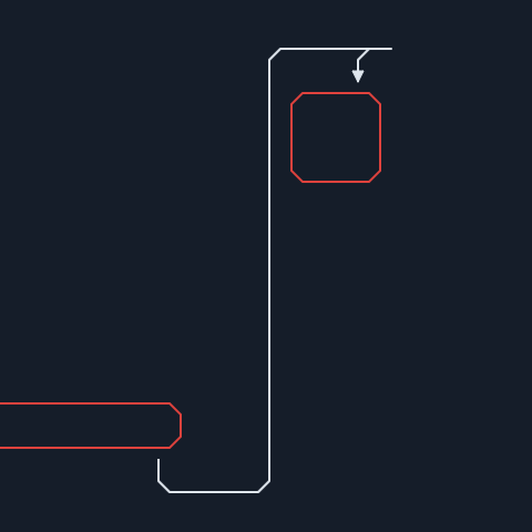
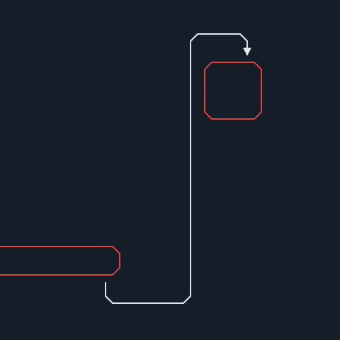
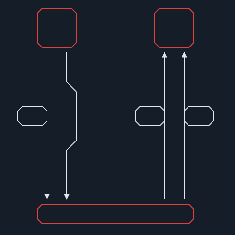
We fixed various issues that occurred when using the routers.RightAngle router, including:
- The last route segment extending beyond the anchor of a target element when the last vertex is near the target.
- Overlapping route segments caused by the exit direction from a vertex being opposite to the entry direction.
- Routes containing unnecessary loops.
- Incorrect routing when the source and target are the same element.
- Incorrect routing when the source and target elements overlap.
- Routes creating unnecessary bends instead of following a straight path.
- Routes choosing the longer side of an element instead of the shorter side when navigating around it.
Before vs. After...
| Before fix | After fix |
|---|---|
 |  |
 |  |
 |  |
 |  |
mvc
mvc.View - fix to allow setting style via options
Allow setting the style attribute via options in the constructor of the mvc.View class.
const view = new mvc.View({ style: { color: 'red' }});
assert.ok(view.el.style.color === 'red');
util
util - add objectDifference() method
We added a new utility function objectDifference(object, base [, opt]) which compares the provided object with the base and returns an object containing only the differences. The opt.maxDepth option can be used to limit the depth of the comparison.
const a = { foo: { bar: 1, baz: 2 }, qux: 3 };
const b = { foo: { bar: 1, baz: 3 }, qux: 3 };

util.objectDifference(a, b); // { foo: { baz: 2 } }
util - expose calc() expression API
We added several methods to help you work with calc() expressions:
isCalcExpression()checks whether the given value is acalc()expression. For example,"calc(w + 100)"istrueand"not a formula"isfalse.evalCalcFormula()evaluates the givencalc()formula. For example,"w + 10"in the context of a rectangle with100x100will produce the number110.evalCalcExpression()evaluates allcalc()formulas in the given expression. For example,"translate(calc(w + 10), 0)"in the context of a rectangle with dimensions100x100will produce the string"translate(110, 0)".
See the custom special presentation attributes section for an example of how to use this API.
util - add cloneCells() method
We exposed a utility function util.cloneCells(cells) for cloning cells.
It's equivalent to graph.cloneCells() method, but it can be used without a graph instance.
g
Geometry - add strict option to containsPoint() of Rect
You can now provide an options object as the second argument of the rect.containsPoint() method. Providing opt.strict changes the behavior of this function - the provided point must be strictly inside the rectangle (i.e. not on the boundary)
const rect = new g.Rect({ x: 10, y: 10, width: 10, height: 10 });
const p = new g.Point({ x: 10, y: 10 });
rect.containsPoint(p); // true
rect.containsPoint(p, { strict: true }); // false